Introduction
Gym & Fitness Website Design Examples are a great source of inspiration for gyms, personal trainers, fitness studios, and wellness brands planning a modern website in 2026. A professionally designed fitness website not only creates a strong first impression but also helps increase memberships, showcase services, and generate more leads. Exploring the best Gym & Fitness Website Design Examples can give you ideas for layouts, branding, booking systems, and conversion-focused features that drive real business growth.
Whether you’re launching a new gym or refreshing your online presence, the right design makes all the difference. At Abdulqadeer.click, we share expert insights and premium Gym & Fitness Website Design Examples to help fitness businesses create high-converting, SEO-friendly, and mobile-responsive websites that attract more members.
In this guide, we look at 15 real gym website design examples and fitness website design examples from the UK and beyond. Each one does something worth copying, whether that is bold branding, a clean booking flow, or honest photography. By the end, you will have a clear list of ideas for your own rebrand, plus a simple checklist to score your current site against.
If you want help applying any of this to your own gym, our team offers digital marketing services for gyms, and you can book a free audit call to get a second opinion on your current site.
Why gym website design matters more in 2026
Fitness is a crowded market. Most towns have several gyms within a short drive, and members compare options online before they ever walk through a door. A strong website design does three jobs at once.
It builds trust. Real photos of your space and your members do more than any stock image ever will. It removes friction. A visitor should never have to hunt for your price or your class timetable. It reflects your brand. A boxing gym should not look like a yoga studio, and a budget gym should not look like a boutique one.
Mobile use has also changed the brief. More than three in four gym website visitors now browse on a phone, so a design that only looks good on a desktop screen is already behind. Add to this the rise of voice search and AI answer engines, and your site now needs to answer questions clearly and quickly, not just look pretty. This is the idea behind fitness website design inspiration in 2026. Good design and good answers now go hand in hand.
There is also a cost side to this. Losing a visitor at the homepage stage is expensive, since most gyms already spend money getting that person there in the first place, whether through paid ads, local search, or a referral from a current member. A slow or confusing website wastes that spend before it has a chance to pay off. Fixing the website is often cheaper than fixing the marketing that feeds it, yet it gets far less attention.
Competitors have also raised the bar. Budget chains, boutique studios, and independent gyms are all investing more in their online presence than they did even two years ago. A site that looked modern in 2023 can now look tired next to a newer competitor down the road. This is exactly why looking at fresh gym website design examples on a regular basis is worth doing, even if you are not planning a full rebrand this year.
What makes a great gym or fitness website
Before we get into the examples, here is a short checklist. Score your own site against each point.
- A clear call to action above the fold, such as book a free trial or join now
- Real photos of your gym floor, classes, and staff, not stock photography
- Transparent pricing, or a price page that is one click away
- A class timetable that is easy to read and easy to book from
- Fast loading on mobile, ideally under three seconds
- Genuine social proof, such as review scores or member numbers
- A tone of voice that matches who the gym is actually for
Keep this list in mind as you read through the examples below. Some nail all seven points. Others are strong on branding but weaker on booking. Both are useful lessons.
A few of these points deserve extra attention. The call to action above the fold is the single most common failure point. Many gym sites bury their join button below a large hero image or a slideshow, which means a visitor has to scroll before they can act. Move it up. A short headline and one clear button is worth more than a beautiful, button free hero banner.
Pricing is the second common issue. Hiding your price behind a contact form feels like it protects negotiating room, but it usually just pushes the visitor to a competitor who is upfront about cost. Even starting from price gives enough information for someone to decide whether to enquire further.
Finally, think about how your site reads to someone who has never set foot in a gym before. Jargon about splits, macros, or specific class formats means little to a beginner. The best sites explain things in plain language first, then go deeper for members who already know what they are looking for.
15 gym and fitness website design examples
Gymbox, London
Gymbox is one of the best known gym websites uk has to offer, and its homepage shows why. The design is loud, colourful, and full of personality, with playful graphics and high energy video that match the brand’s cheeky tone. Navigation is kept simple despite the bold visuals, with clear paths to London locations, classes, and personal training. The lesson here is that a strong personality does not need to come at the cost of usability.
Third Space, London
Third Space sits at the premium end of UK fitness, and its website reflects that positioning. The design leans on clean typography, moody photography, and plenty of white space, giving the impression of a private members’ club rather than a standard gym. Location pages are detailed, with facility lists and class information laid out clearly. This is a strong reference point for any gym trying to justify a higher price point through design alone.
PureGym, UK wide
PureGym runs hundreds of sites across the country, so its website has to work at scale. The design favours simplicity over flair, with a location finder placed front and centre and pricing shown early in the journey. Every gym page follows the same template, which keeps the experience consistent no matter which town a visitor is searching from. For multi-site operators, this is a useful lesson in building a system rather than a single page.
JD Gyms, UK wide
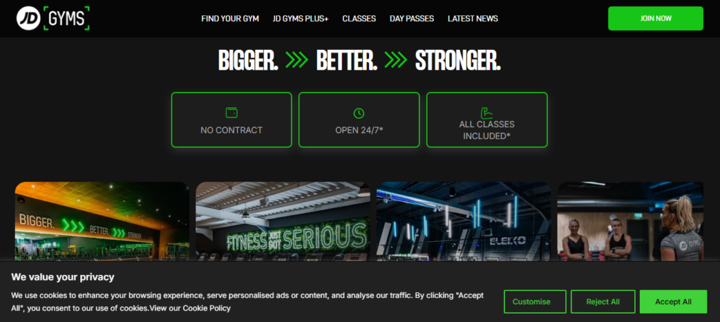
JD Gyms takes a similar multi-location approach but leans harder into bold red branding and high contrast imagery. The homepage uses strong colour blocks and confident headlines to communicate energy and value. Joining information sits close to the top of the page, and the site avoids clutter by pushing detailed facility lists onto separate location pages. It is a clean example of branding and simplicity working together.
Barry’s, global
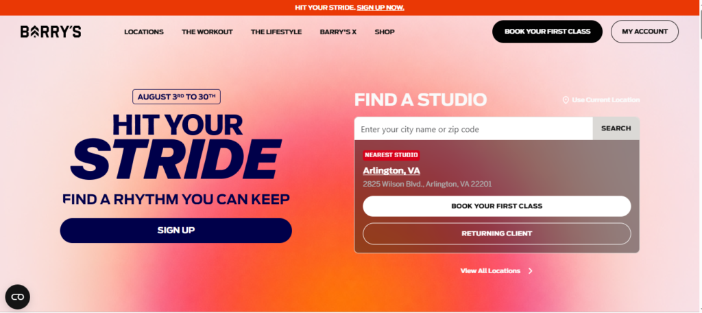
Barry’s built its entire brand around a signature workout format, and its website design mirrors that intensity. High quality imagery of members mid workout sits alongside bold, easy to read typography. Calls to action for booking a class or buying merchandise are placed clearly throughout the page, and the design never lets the visitor forget what makes the brand distinctive. This is a good example of a website built entirely around one core selling point.
GoodLife Fitness, Canada
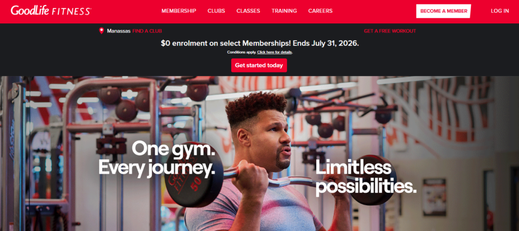
GoodLife is one of the largest gym chains in North America, yet its website avoids feeling cold or corporate. A bold red and white identity runs through every page, with membership messaging placed clearly near the top. Despite operating hundreds of locations, the site still manages to feel approachable rather than mass produced. This balance between scale and warmth is worth studying for any growing gym brand.
EOS Fitness, US
EOS Fitness uses large-scale imagery and video across its homepage to create an immediate sense of energy. The domain and branding are tightly matched, which helps with both recognition and search visibility. Navigation stays simple even with a large site, proving that scale and clarity are not mutually exclusive when the structure is planned properly from the start.
MADabolic, US
MADabolic stands out through colour and detail rather than scale. A teal, white, grey, and black palette gives the brand a distinctive look, and a repeated arrow motif ties the design together across every page. The font choice feels sharp and modern, and navigation buttons are simple and easy to find. This shows how a smaller studio brand can use a tight colour palette to look far more polished than its size might suggest.
Sweat FXBG, US
Sweat FXBG takes a minimalist approach, using high quality photography and a clean, transparent navigation bar to reduce clutter. The result is a site that feels calm and easy to browse, letting the imagery do most of the talking. For gyms that want to feel premium without heavy branding, this quieter style of design is a strong template to follow.
OV CrossFit, US
OV CrossFit opens with a short, confident headline and a single, obvious call to action to book a free trial. There is no attempt to explain everything on the homepage. Instead, the design trusts the visitor to click through for more detail once they are interested. This restraint is a useful reminder that a homepage does not need to do all the selling in one go.
Nosotros Climbing Club, Cleveland
Nosotros is a climbing gym aimed at complete beginners, and its website design reflects that audience directly. The homepage leads with a pay later message and a free trial offer, removing financial risk before price is even mentioned. The founder’s own story sits on the about page, and pricing is shown plainly with no hidden contact forms. This is one of the clearer fitness website design examples of design built around a specific type of visitor rather than a generic audience.
A San Diego climbing and yoga studio
One well regarded example from San Diego combines a climbing gym with a yoga studio inside more than 25,000 square feet of space. The homepage uses full bleed photography and gentle parallax scrolling to show off both the climbing walls and the light filled yoga room. Colours are kept muted so the photography carries the design. A simple first time visitor button guides new users, while copy stays short and focused on experience rather than sales language.
Freeletics, global
Freeletics is a fitness app rather than a traditional gym, but its website design offers useful lessons for any fitness brand. The site leans on personalisation, using smart features to suggest tailored training plans based on a visitor’s goals. This kind of intelligent, adaptive design points to where fitness websites are heading next, with AI shaping the experience rather than a single static page for every visitor.
A boutique personal training studio
Many strong personal trainer websites share a similar formula. Warm photography, clean typography, and clearly listed contact details create an impression of professionalism from the first scroll. Streamlined navigation makes it easy to find intro packages or frequently asked questions without digging through menus. For solo trainers or small studios, this simpler structure often converts better than an overly complex site.
Gutzfit

Gutzfit is a good example worth bookmarking if you want ongoing gym website design inspiration and fitness content ideas, since it covers training and lifestyle content in a clean, easy to browse format. It is a useful reference point alongside the bigger gym chains listed above, particularly if your gym also publishes blog content or training guides.
What these examples have in common
Looking across all 15 sites, a few patterns repeat. The strongest sites keep their call to action visible without scrolling. They use real photography rather than stock imagery, and they show pricing early rather than hiding it behind a contact form. Booking is built into the page itself, not tucked away on a separate platform that feels disconnected from the main site.
Personality also matters. Gymbox and MADabolic prove that bold branding can work, while Sweat FXBG and the San Diego studio prove that a quieter, photography-led approach works just as well. There is no single right answer here. What matters is that the design matches who the gym is actually for.
Trust signals show up again and again too. Whether that is a review count, a member story, or a founder’s own background as with Nosotros, visitors respond well to proof that other real people have already had a good experience. A polished design without any social proof still asks the visitor to take a leap of faith. A polished design with a few honest testimonials asks for much less.
Finally, almost every strong example treats the class timetable and the join button as core parts of the homepage rather than an afterthought buried in a menu. If a visitor has to click through two or three pages before they can see when a class runs, that is a design problem worth fixing before anything else on this list.
Read More Article : What Is A Digital Marketing Strategy That Can Bring Results For Your Gym?
Turning inspiration into a rebrand
Looking at other sites is a useful starting point, but a rebrand needs more than a mood board. Start by scoring your current site against the seven point checklist above. Be honest about where it falls short. Most gyms lose points on mobile speed and on hiding their pricing, so those two areas are worth checking first.
Next, decide what your brand actually needs to communicate. A boxing gym and a wellness studio should never use the same tone of voice, even if they use the same booking software underneath. Once that tone is clear, design choices such as colour, photography style, and copy become far easier to make.
It also helps to plan the rebrand in stages rather than trying to change everything overnight. Start with the homepage, since that carries the most traffic and the most first impressions. Fix the call to action, swap in real photography, and make sure the price or a clear path to it sits near the top. Once that page is working well, move on to location pages, class pages, and the timetable itself.
Photography is usually the single highest impact change you can make, and often the cheapest. A short photoshoot with your own members and coaches, done properly with good lighting, will outperform a design overhaul that still leans on stock imagery. If the budget is tight, start there before spending on anything else.
It is also worth testing changes rather than guessing. Small adjustments, such as moving your join button higher on the page or simplifying your pricing table, can be measured fairly quickly through your booking numbers. A rebrand does not need to be a single big leap. It can be a series of small, tested improvements that add up to a much stronger site by the end of the year.
If you would rather not tackle this alone, our team works specifically on digital marketing services for gyms, covering everything from website design through to local SEO and lead generation. You can also book a free audit call if you want a straightforward, no pressure review of your current site before you commit to a rebrand.
Frequently asked questions
What makes a good gym website design in 2026?
A good gym website design in 2026 combines fast mobile loading, real photography, clear pricing, and an easy booking flow above the fold.
Do UK gyms need a different website approach to US gyms?
The core principles stay the same worldwide, though UK gyms often benefit from clearer pricing pages given how price sensitive the local market is.
How much does a gym website rebrand cost?
Costs vary widely, from a few hundred pounds for a template based site to several thousand pounds for a fully custom design with booking integration.
Should a gym website use stock photography?
No, real photos of your own space, staff, and members build far more trust than stock photography and tend to convert better.
How often should a gym refresh its website design?
Most gyms benefit from a full design refresh every two to three years, with smaller content and photography updates happening more often in between.
Final thoughts
The 15 examples above show that there is no single formula for a great gym or fitness website. Some brands win through bold personality, others through calm, photography led simplicity. What they all share is a focus on the visitor’s first ten seconds on the page, and a clear path from that first click to an actual booking.
If your current site is not doing that job, now is a good time to change it. Head back to our homepage to see how we approach gym website design and marketing, or book a free audit call to talk through your rebrand with our team directly. You can also find more marketing breakdowns on our Medium page if you want further reading before you start.