Introduction
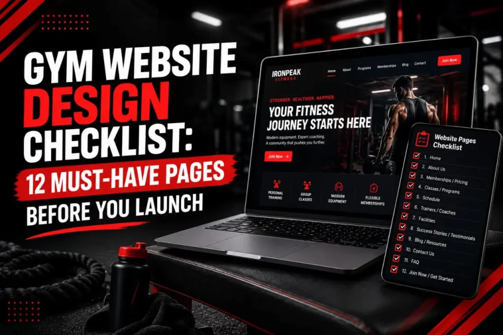
A successful gym website needs more than an attractive homepage. Before launching, you need the right pages to build trust, explain your services, answer customer questions, and make it easy for visitors to take action. At abdulqadeer.click, this Gym Website Design Checklist covers the 12 must-have pages every gym, fitness center, or personal training business should consider before going live.
From your homepage and membership plans to trainer profiles, class schedules, contact information, and testimonials, each page has an important role in turning visitors into potential members. This Gym Website Design Checklist can also help you create a clearer user experience and strengthen your website’s SEO foundation. If you’re preparing a new fitness website, use this Gym Website Design Checklist to make sure nothing important is missing before launch.
This checklist ensures you launch a complete gym website design uk that actually works. We’ve reviewed hundreds of fitness websites. The successful ones share common pages and features. The failing ones miss basic essentials.
Read on to discover the 12 pages every fitness website needs. Learn why each page matters. Understand how to structure your gym website for maximum conversions.
Why Gym Website Design Matters More Than You Think
Your website is often the first impression potential members have of your gym. Before they walk through your doors, they visit your site. They judge your facility based on what they see online.
A strong gym website design uk shows professionalism. It builds trust with your audience. It answers their questions before they call you. It makes joining your gym as simple as possible.
Consider this reality. Most people searching for gyms near them start online. They want to see your facilities. They want to check your class schedules. They want to know your membership prices. If your website doesn’t provide this information, they move to your competitor’s site.
The fitness industry is competitive. Your gym website design must stand out. It needs to be faster than competitors’ sites. It needs to load on mobile phones instantly. It needs clear calls to action on every page.
Fitness website ideas that work involve more than just looking good. Your site must be functional. It must guide visitors toward joining. It must answer common objections. It must make the joining process simple.
The 12 Must-Have Pages for Your Gym Website
1. Home Page: Your Digital Front Door
Your home page is crucial. It gets the most traffic. Visitors decide in seconds whether to explore further or leave.
Your fitness club website design should feature a striking hero section on the homepage. This section needs a high quality image of your gym. Show happy members working out. Include a clear headline that speaks to your target audience.
Keep your headline simple. Use language your potential members understand. Avoid jargon. Tell them exactly what you offer. For example, use “Join the Best Gym in Manchester” rather than something vague.
Below your hero section, include your key benefits. List what makes your gym unique. Do you offer personal training? Do you have the newest equipment? Do you provide group classes? Tell them.
Add a prominent call to action button. Make it stand out visually. Use words that encourage action. “Start Your Free Trial” works better than “Learn More.” This button should link to your membership page or a contact form.
Your home page should also feature member testimonials. Social proof matters. Real success stories convince people to join. Include before and after images if possible. Add the member’s name and membership duration.
Include your gym’s opening hours. Include your contact number. Include your location. Make this information impossible to miss. Many visitors check these details before deciding to visit.
2. Membership Page: Your Revenue Generator
This page directly impacts your revenue. Many gym websites bury their membership information. Do not make this mistake.
Create a dedicated page for your membership options. List every membership tier you offer. Use a clear comparison table. Show what each membership includes. Highlight the differences between tiers.
Price your memberships clearly. Do not hide pricing behind contact forms. People want to know costs upfront. Transparency builds trust.
For each membership tier, explain what is included. Does the basic tier include equipment access only? Does the premium tier add personal training sessions? List it clearly.
Include a strong call to action for each tier. Use buttons that say “Choose This Plan” or “Get Started.” Make buying a membership simple.
Your gym website design for this page should use contrasting colours. Make the recommended tier stand out. Perhaps highlight it with a subtle background colour or a badge that says “Most Popular.”
Address common questions on this page. Can members pause their membership? What is the cancellation policy? How many guests can members bring? Answer these questions here.
3. Classes Page: Showcase Your Schedule
Group fitness classes drive membership sales. People join gyms to attend specific classes. Your gym website design must showcase your class offerings.
Create a dedicated page listing all your classes. Organise them by time of day. Show the class schedule in a clear table or calendar format.
For each class, include details. What time does it start? How long does it run? Which instructor teaches it? What is the difficulty level? Is it suitable for beginners?
Include descriptions of what each class offers. Many potential members do not understand the difference between spin and HIIT. Explain what to expect. Describe the benefits. Use simple language.
Add professional photos of each class. Show real members taking part. Show the energy and community. High quality images matter here.
Consider adding video clips of your classes. Short 30 second videos show potential members what they are getting. They build excitement. They help people decide if a class suits them.
Link to instructor profiles from this page. Members like to know who teaches their classes. Professional instructor profiles build credibility.
4. Personal Training Page: Premium Service Showcase
Personal training generates high margin revenue for most gyms. You need a dedicated page that sells this service.
Explain what personal training involves. Detail your personal training packages. Show pricing for various session quantities.
Feature your personal trainers on this page. Include their photos. Include their qualifications. Include their specialties. Do you have trainers specialising in weight loss? Do you have trainers for athletes? Feature this expertise.
Include client success stories on this page. Before and after transformations show the power of personal training. Include the timeline of the transformation. Include the client’s testimonial.
Explain your training process. Walk potential clients through what to expect. Many people have never worked with a personal trainer. Ease their concerns.
Include a clear call to action. Make it simple to book a consultation. Use language like “Book Your Free Consultation” or “Get Your Custom Training Plan.”
5. Facilities Page: Show Your Equipment and Amenities
People join gyms for the facilities. You need a page that showcases what you have.
List your equipment categories. Do you have free weights? Cardio machines? Cable machines? Swimming pool? Sauna? List it all.
Include high quality photos of each facility area. Show your cardio section. Show your weight training area. Show your stretching zone. Show your locker rooms. Show your showers.
Many gym websites fail to show facilities clearly. Your fitness club website design should be transparent. Show exactly what potential members will have access to.
Describe the condition of your equipment. Are your machines new? Do you maintain them regularly? Tell potential members. Old equipment drives people away.
Include information about your changing facilities. Are lockers secure? Are showers clean? Do you provide towels? Do you provide shampoo? These details matter to potential members.
Mention any unique features. Do you have a crèche? Do you have a cafe? Do you have parking? Include it here.
6. Pricing Page: Make Purchasing Simple
Create a dedicated pricing page. Do not assume your membership page is enough.
List all costs transparently. Initial sign up fees. Monthly membership costs. Any other charges. No surprises.
Include membership comparison tables. Show what each tier includes. Use ticks and crosses to make comparisons quick.
Add frequently asked questions about pricing. Can members pay weekly instead of monthly? Do you offer corporate discounts? What about family memberships? Answer these questions.
Include a call to action on this page. Make it easy to sign up or schedule a free trial.
7. Contact Page: Remove Barriers to Communication
Many potential members want to contact you before joining. Make this simple.
Include a contact form. Ask for their name and email address. Ask what they want to know about. Keep it simple. Long forms reduce submissions.
Include your phone number prominently. Include your email address. Include your address and a map showing your location.
List your opening hours clearly. Tell people the best times to visit or call.
Include links to your social media profiles. Many people prefer contacting businesses via social media.
Consider adding a chat feature. Live chat increases conversions. Potential members can ask questions instantly. You can address their concerns immediately.
8. About Us Page: Build Trust and Connection
People want to know who they are joining. Your About Us page builds trust.
Tell your gym’s story. Why did you start the gym? What was your vision? What problem were you trying to solve?
Include information about your management team. Use professional photos. Include their background and qualifications.
Explain your gym’s values and mission. What do you stand for? What is your commitment to members?
Include information about your community involvement. Do you sponsor local sports teams? Do you support charity events? Tell this story.
Include testimonials from long term members. Why do they stay? What makes your gym special to them?
Make this page personal. Avoid corporate jargon. Write like a human. This authenticity builds connection.
9. Blog Page: Drive Traffic Through Content
A blog section improves your fitness website ideas and search engine visibility. Blogs drive organic traffic.
Create blog posts targeting fitness related keywords. “How to Start an Exercise Routine” attracts people searching for fitness advice. “Best Exercises for Back Pain” attracts people with specific concerns.
Link blog posts back to relevant pages on your website. A post about “Beginner HIIT Workouts” should link to your classes page. A post about “Benefits of Personal Training” should link to your personal training page.
Update your blog regularly. Fresh content signals to search engines that your site is active. Aim for at least one new post per month.
Use keywords naturally in your blog posts. For example, naturally incorporate “gym website design uk” or “fitness club website design” where relevant. Do not force keywords. Write for readers first.
Include clear calls to action in each blog post. “Ready to join? Check out our membership options” directs readers to your membership page.
10. Testimonials Page: Social Proof That Converts
Dedicate an entire page to member testimonials. Social proof is powerful. Real results convince people to join.
Include testimonials with photos. Anonymous testimonials have less impact. Real faces build credibility.
Include specific details in testimonials. “I lost 20 pounds in 6 months” is more powerful than “I lost weight.” Specific details feel authentic.
Include testimonials from various member types. Include someone who lost weight. Include someone who gained muscle. Include someone who improved their fitness for health reasons. Include someone over 50. Include someone who was previously inactive.
Include video testimonials if possible. Video is more convincing than text. Seeing someone speak builds connection.
Rotate testimonials regularly. Update this page quarterly. Fresh testimonials show ongoing success.
11. FAQ Page: Answer Common Objections
Many potential members have the same questions. Create a comprehensive FAQ page.
Answer questions about membership. Can I cancel anytime? What if I travel for work? Do you offer refunds? Answer these.
Answer questions about joining. Do I need experience? Do I need to sign a contract? Do I get an induction? Answer these.
Answer questions about classes. Can I drop in to classes? Do I need to book in advance? Can I take a class before joining? Answer these.
Answer questions about facilities. Are lockers free? How clean are your facilities? How new is your equipment? Answer these.
Answer questions about personal training. How much does it cost? How do I get started? Can I try it first? Answer these.
Organize your FAQ logically. Group related questions. Use clear headings. Make it simple to find answers.
12. Free Trial or Consultation Page: The Conversion Engine
This page should exist to convert hesitant visitors. Remove all barriers to taking action.
Make it clear what visitors get with a free trial. One week free membership? One free class? One free consultation? Be specific.
Keep the sign up form short. Ask for name, email, and phone number only. Long forms reduce conversions.
Explain what happens next. When will they hear back? When can they visit? What should they bring?
Include a strong guarantee. “Try us free, no credit card required” removes risk.
Use a compelling headline. “Start Your Fitness Journey Free” beats generic alternatives.
Include testimonials from people who took the free trial. “I was nervous, but the free trial convinced me to join.”
Design Principles for Fitness Websites
Your fitness club website design extends beyond these 12 pages. Your overall design approach matters.
Use mobile responsive design. Most visitors use phones. Your site must work perfectly on mobile. No exceptions.
Use fast loading times. Slow sites drive people away. Optimise your images. Minimise code. Use a quality hosting provider.
Use clear navigation. Visitors should find what they need in three clicks maximum. Use descriptive menu labels.
Use readable fonts. Use dark text on light backgrounds. Make font sizes large enough. Many visitors are over 40.
Use appropriate colours. Fitness websites often use bold colours like red, orange, or electric blue. Choose colours that reflect your gym’s personality. Ensure contrast for readability.
Use professional photography. Blurry or poorly lit photos hurt your credibility. Invest in professional gym photography. It converts better than stock photos.
Use trust signals. Include your business registration details. Include membership certifications. Include years in business.
Optimise for Conversions
Your gym website design must drive memberships. Every element should push toward conversion.
Use clear calls to action throughout your site. Every page should have at least one. Use action oriented language. “Join Now” beats “Learn More.”
Use urgency in your messaging. Limited time offers work. Free trial for new members only. Limited spaces in premium classes.
Use social proof everywhere. Include testimonials. Include member counts. Include reviews. People follow the crowd.
Use benefit focused language. Do not just list features. Explain what members get. “Unlimited group fitness classes” is a feature. “Get fit with friends and stay motivated” is a benefit.
Use simple language. Avoid fitness jargon. Explain terms when you use them. Write for the general public, not fitness experts.
Use multiple conversion paths. Some people want to book a free trial. Some want to call you. Some want to email questions. Support all paths.
Getting Help With Your Gym Website
Building a complete gym website design is complex. If you lack time or technical skills, consider getting professional help.
We specialise in helping gym owners build effective websites. We understand the fitness industry. We know what converts visitors into members.
If you want guidance on your gym website design, book a free consultation call. We can review your current website. We can identify gaps. We can create a plan to improve your membership sales.
Visit our digital marketing services for gyms page to learn more about how we help fitness businesses grow online.
Implementation Timeline
Do not try to build all 12 pages at once. Work systematically.
Week 1 to 2: Build your home page and membership page. These drive most conversions.
Week 3 to 4: Build your classes page and facilities page. These showcase what you offer.
Week 5 to 6: Build your personal training page and pricing page. These drive premium revenue.
Week 7 to 8: Build your contact page, about us page, and testimonials page. These build trust.
Week 9 to 10: Build your blog, FAQ, and free trial pages. These drive traffic and conversions.
This phased approach allows you to launch quickly. You can add missing pages over time.
Common Mistakes to Avoid
Do not build your website without a strategy. Know your target audience. Know what they want. Build for them.
Do not hide your pricing. Transparency builds trust. Showing your prices does not hurt your sales.
Do not neglect mobile design. Mobile is not optional. It is essential. Your gym website design must work perfectly on phones.
Do not use auto playing videos on your home page. Auto playing videos annoy visitors. They slow page load times. Let visitors choose to watch.
Do not use outdated photos. Old photos make your gym look old. Invest in fresh photography regularly.
Do not ignore analytics. Check which pages visitors view. Check where they drop off. Check which pages drive conversions. Use this data to improve.
Do not forget local SEO. Optimise for local searches. Include “near me” keywords. Include location specific pages. This drives foot traffic.
Testing and Optimisation
Your gym website design should evolve. Launch with your 12 pages. Then test and improve.
Track your metrics. How many visitors do you get? How many become members? Which pages drive conversions? Which pages have high bounce rates?
Test different headlines. Test different call to action text. Test different colours. Small changes often improve conversions.
A/B test your most important elements. Test your membership page button. Test your home page headline. Run tests for two weeks. Compare results. Implement the winner.
Gather feedback from members. Why did they join? What almost stopped them? What could improve? Use this feedback to enhance your site.
Measuring Success
Your gym website design investment should show results. Track these key metrics.
Increase in membership sign ups. This is your primary metric. Better design drives more sign ups.
Increase in free trial bookings. Track how many people book trials through your website.
Increase in phone inquiries. Some people prefer calling. Track how your website influences these inquiries.
Increase in organic traffic. Better websites rank higher in Google. Track your organic traffic growth.
Improvement in mobile traffic. Track if your mobile traffic increases after improving mobile design.
Reduction in bounce rates. High bounce rates indicate poor design. Lower bounce rates show improvement.
Wrapping Up: Your 12 Page Gym Website Blueprint
You now have a complete blueprint for building a gym website that converts. You know the 12 pages you need. You understand why each matters.
Do not wait. Start building today. Begin with your home page and membership page. Add the remaining pages over time.
If you are unsure about your fitness website ideas or need professional guidance, reach out. We help gym owners build websites that drive memberships.
For a detailed review of your current website and a customized improvement plan, book your free audit call today. We can identify exactly what is costing you lost memberships.
Learn more about our digital marketing services for gyms to see the full range of support we offer.
You can also follow our latest fitness and digital marketing insights on Medium where we share strategies that work.
Remember this: your gym website is working for or against you. Make sure it is working for you. Implement these 12 pages. Optimise regularly. Watch your membership sales grow.
Your potential members are searching online right now. Make sure your gym website design uk is ready to convert them.