Introduction
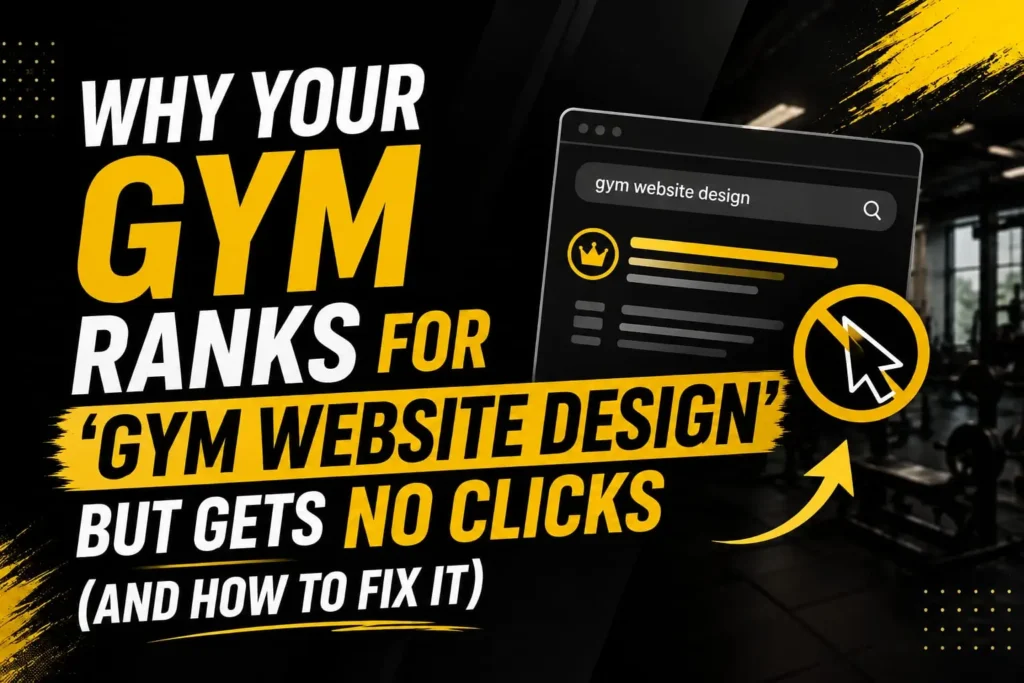
Ranking on Google for a valuable keyword is only half the battle. Your gym website may appear for gym website design, yet still receive very few clicks because the title, meta description, search intent, or overall SERP presentation fails to attract potential visitors. At abdulqadeer.click, we’ll explore why your page can rank well but struggle to turn impressions into clicks.
This guide explains the most common reasons behind low click-through rates and shows practical ways to improve them. From creating stronger titles and compelling meta descriptions to matching search intent and highlighting your gym’s unique value, small changes can make a noticeable difference. If your gym website design page is getting impressions without traffic, these strategies can help you transform rankings into meaningful clicks. Learn how better gym website design SEO can bring more qualified visitors.
You searched for gym website design. Your site showed up on page one. You felt good about it for about ten minutes.
Then you checked your analytics.
Impressions were healthy. Clicks were not. Sign ups were worse. This is one of the most common problems I see when I run audits for fitness businesses. Ranking is not the same as being chosen. A gym can sit near the top of Google and still lose members to a competitor three spots below, simply because that competitor’s listing looks more trustworthy, more relevant, or more useful in the two seconds someone spends scanning results.
This post explains why that happens and what to do about it. It is written for gym owners, studio managers, and fitness marketers who want their gym website design to actually convert, not just rank.
The Gap Between Ranking and Being Clicked
Search engines rank pages based on relevance and authority signals. People click based on trust and instant appeal. These are two different jobs, and most gyms only do the first one well.
Your gym website design might tick the boxes Google cares about. Fast loading. Mobile friendly. Keyword in the title. But none of that convinces a real person to tap through instead of the gym next to you in the results.
Think about your own habits. When you search for something local, you scan titles, you glance at star ratings if they show, and you make a snap judgement in under three seconds. If your listing looks generic, outdated, or unclear, you get skipped. It does not matter that you rank. You still lose the click.
This is the zero click problem. Your page exists in the results. Nobody enters it.
Why This Happens to Gyms Specifically
Gyms have a unique set of challenges that make this worse than in most other industries.
1. Every Gym Website Looks the Same
Open ten gym websites in your area. You will see the same formula almost every time. A hero image of someone lifting weights. A tagline like “Transform Your Body, Transform Your Life.” A membership pricing table. A contact form at the bottom.
None of this is wrong on its own. The problem is sameness. When your gym web design looks identical to every competitor, the search result snippet also looks identical. There is nothing in your title tag or meta description that gives someone a reason to pick you over the next listing.
2. Titles and Descriptions Are an Afterthought
Most gym owners focus their energy on the visual design of the site itself. Colours, photos, layout. Very few spend real time on the title tags and meta descriptions that actually show up in search results.
This is a mistake. Your title tag and meta description are your advert. They are the only part of your gym website design that Google displays before someone clicks. If they read like filler text, people scroll past.
A weak example: “Home | Fitness Gym | Best Gym in Town.”
A stronger example: “24 Hour Gym in Manchester | No Contract, Free Trial Week.”
The second one tells a searcher exactly what they get and removes a common objection, being locked into a contract, in a single line.
3. No Local Trust Signals in the Snippet
Local search is emotional. People are choosing somewhere they will visit multiple times a week, often somewhere near their home or workplace. They want proof before they click, not after.
If your site does not surface reviews, member numbers, or clear location details in a way that search engines can pull into the results, you are asking people to click blind. Most will not.
4. Slow Pages Kill Momentum Before It Starts
Even a well ranked page loses clicks if load speed data looks poor, and it loses visitors instantly if the page is genuinely slow once they land. Fitness audiences search on their phones, often on the move, often between sets or on a lunch break. A three second delay is enough to lose them.
Good website design for gyms treats speed as a ranking factor and a conversion factor at the same time. It is not optional polish. It is the foundation everything else sits on.
5. The Page Does Not Match the Search Intent
Someone searching “gym near me open now” wants hours and a map. Someone searching “best gym for beginners” wants reassurance and a clear starting point. Someone searching “gym membership prices” wants numbers, not a phone call request.
If every search leads to the same generic homepage, you are mismatching intent. Search engines notice when people click through and bounce straight back. Over time, that behaviour quietly damages your rankings too.
What Actually Drives Clicks in Fitness Search Results
Here is the part most gym owners skip. Ranking well is the entry ticket. Getting clicked is a separate skill, and it comes down to a handful of specific, fixable details.
Write Titles That Answer a Question
Every high performing gym website design starts with a title tag that answers an implied question. What kind of gym is this? Where is it? What makes it different?
Instead of naming your gym followed by generic words, lead with the benefit or the differentiator. “Women Only Gym in Leeds, No Judgement Zone” will outperform “Welcome to FitLife Gym” every time, because it tells the searcher something specific before they even land on the page.
Use Meta Descriptions as Mini Adverts
Treat your meta description like the copy on a flyer. State what the gym offers, remove one objection, and give a reason to act now. Something like:
“Full equipment gym with personal trainers included. First class free, no card needed. Open 5am to 11pm daily.”
That single line does three jobs. It states the offer, removes the risk (no card needed), and gives urgency through the free trial.
Get Real Reviews Showing in Search
Star ratings pulling through into search results are one of the strongest click drivers available to any local business, gyms included. If your gym has happy members but few reviews, this is one of the fastest wins available. Ask satisfied members directly, right after a good session, when the goodwill is highest.
Match Each Page to a Real Search Intent
Rather than funnelling every keyword to your homepage, build dedicated pages. A page for personal training. A page for group classes. A page for membership pricing. A page for beginners. Each one should be built to satisfy the exact intent behind the search term that brings someone there.
This is where structured gym web design pays off. Instead of one page trying to be everything, you build a small set of focused pages, each one written and designed for a specific type of visitor.
Design for the First Three Seconds
Once someone does click through, the visual design has one job in the opening moments, confirm they made the right choice. A clear headline restating the offer. A visible call to action. A photo that looks like the real gym, not a stock image from a completely different country.
Generic stock photography is a quiet trust killer. People can usually tell. Real photos of your actual space, your actual equipment, your actual members if you have permission, do more for conversion than any clever line of copy.
A Simple Framework: Rank, Trust, Convert
I use a three stage framework with every gym I work with, whether that is a boutique studio or a large multi site chain.
Rank. This covers the technical and content basics: page speed, mobile usability, keyword targeting, and structured local SEO. This is what gets you into the results in the first place.
Trust. This covers everything that convinces a searcher to click your result over a competitor’s: title tags, meta descriptions, review scores, and consistent branding across the search snippet and the landing page.
Convert. This covers what happens after the click: page load, clear offer, simple next step, and a design that matches what was promised in search.
Most gyms invest heavily in the first stage and almost nothing in the other two. That imbalance is exactly why you can rank and still hear silence where sign ups should be.
Auditing Your Own Gym Website Design
You do not need expensive tools to spot most of these problems. Here is a short process you can run yourself in under thirty minutes.
Step one. Search your own gym on Google, in an incognito browser window, on your phone. Look at your listing exactly as a stranger would. Does the title tell you anything useful. Does the description give you a reason to click.
Step two. Check your star rating and review count against your three closest competitors. If you are behind, this is likely costing you clicks daily.
Step three. Click through to your own site and time how long it takes to load on mobile data, not wifi. If it drags, so does your conversion rate.
Step four. Look at your homepage and ask honestly, would a first time visitor know within five seconds what type of gym this is and what to do next.
Step five. Check whether your key pages, pricing, classes, personal training, exist as separate pages or whether everything funnels back to one generic homepage.
If two or more of these steps reveal a gap, that gap is very likely where your clicks are leaking out.
Common Mistakes That Quietly Sabotage Clicks
A few patterns show up again and again during audits.
Duplicate title tags across pages. When every page on the site shares the same or a near identical title, search engines struggle to know which page to show for which query, and searchers see the same unhelpful text no matter what they searched.
Missing location details. A gym that does not clearly state its suburb, city, or nearby landmarks in its content and metadata makes it harder for local search to connect the dots, and harder for a searcher to judge convenience at a glance.
Overpromising in the design, underdelivering on the page. If the search snippet mentions a free trial but the actual page buries it three scrolls down behind a wall of text, visitors leave frustrated rather than convinced.
No clear single call to action. Pages with five competing buttons, book a class, call now, download our app, join our newsletter, email us, tend to convert worse than pages with one obvious next step.
Ignoring page speed on older content management platforms. Many gym sites are still running on outdated builders that were never optimised for fast mobile loading. This drags down both rankings and conversion at the same time.
Why Fixing This Matters More Than Chasing New Keywords
A lot of gym owners respond to a click problem by chasing more keywords, writing more blog posts, or trying to rank for new terms entirely. This usually makes things worse before it makes them better, because it adds more pages built on the same weak foundation.
Fixing the click through problem on the traffic you already have is nearly always cheaper and faster than trying to generate more traffic that will convert at the same poor rate. If your gym gets five hundred impressions a month for gym website design related terms and converts at one percent, doubling your impressions still only doubles a very small number. Improving your click through rate and conversion rate from that same five hundred impressions can produce a bigger, faster result with none of the extra spend.
This is the part of fitness club website design that gets overlooked constantly. Everyone focuses on getting found. Very few focus on what happens in the moments right after someone finds you.
What Good Gym Website Design Actually Looks Like in Practice
Pulling everything together, a gym website design that both ranks and converts tends to share a few consistent traits.
It has unique, benefit-led titles on every page, not just the homepage. It surfaces trust signals, reviews, member counts, certifications, in places search engines and humans both notice. It loads fast on mobile, because that is where most fitness searches happen. It separates its content into intent specific pages rather than cramming everything onto one homepage. It uses real photography instead of generic stock imagery. And it gives every visitor one clear, obvious next step, whether that is booking a free class, calling the front desk, or starting a trial membership.
None of this requires a total rebuild. Most gyms can fix the biggest leaks with focused changes to titles, descriptions, page structure, and a handful of trust signals, without touching the overall look of the brand.
Next Steps
If you recognise your own gym in any part of this post, ranking reasonably well but not seeing the clicks or sign ups to match, the good news is this is one of the more fixable problems in fitness marketing.
Start with the audit steps above. They will tell you exactly where the leak is. From there, prioritise your title tags, your meta descriptions, and your page speed first, since these three changes tend to produce the fastest visible movement in click through rate.
If you would rather have a second pair of eyes look at your site properly, you can see how I approach this across the gym page for services, or head to the home page to see more of the work behind it.
I also write longer breakdowns on gym web design, website design for gyms, and fitness club website design on Medium, if you want more detail before making changes.
And if you would rather just talk it through, you can book a free audit call and I will walk through your current site with you, live, and show you exactly where the clicks are being lost.
Frequently Asked Questions
Why does my gym rank well but get no clicks?
Ranking depends on relevance signals search engines can measure, such as speed, keywords, and mobile usability. Clicks depend on trust signals a human notices in two or three seconds, such as your title, your review score, and how specific your listing sounds. A gym can satisfy the first without satisfying the second.
What is the fastest fix for low click through rate?
Rewrite your title tags and meta descriptions so they state a specific benefit and remove a common objection, such as no contract or a free trial. This usually produces the quickest measurable change.
Does page speed really affect gym website conversions?
Yes. Fitness audiences search heavily on mobile, often with limited time. Slow loading pages lose visitors before they see any of your offer, regardless of how good the design looks once loaded.
Should every service have its own page?
Yes. Separate pages for classes, personal training, membership pricing, and beginner information let each page match a specific search intent, which improves both relevance for search engines and clarity for visitors.
How often should gym website design be reviewed?
A light audit every three months and a fuller review once a year is a reasonable pace for most gyms, particularly around title tags, page speed, and review scores, since these change the most over time.